Модераторы: Illuminaty
  

Поиск:

Ответ в темуСоздание новой темы Создание опроса
> выгнутые углы 
:(
    Опции темы
MrDmitry
Дата 16.8.2011, 16:32 (ссылка) | (нет голосов) Загрузка ... Загрузка ... Быстрая цитата Цитата


Опытный
**


Профиль
Группа: Участник
Сообщений: 556
Регистрация: 10.11.2006

Репутация: нет
Всего: нет


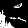
Здравствуйте. Помогите выгнуть углы у div т.к на картинке. в начале хотел использовать 1 див с выгнутым левым и правым бордюром но border-radius не понимает отрицательные значения. Так что это похоже плохая идея
user posted image

Это сообщение отредактировал(а) MrDmitry - 16.8.2011, 16:33
PM MAIL   Вверх
0Scrum
Дата 17.8.2011, 01:03 (ссылка) | (нет голосов) Загрузка ... Загрузка ... Быстрая цитата Цитата


Новичок


Профиль
Группа: Участник
Сообщений: 47
Регистрация: 24.1.2011

Репутация: 2
Всего: 3


1.Картинками повесить как бг.
2.Использовать after и before

PM MAIL   Вверх
MrDmitry
Дата 17.8.2011, 18:34 (ссылка) | (нет голосов) Загрузка ... Загрузка ... Быстрая цитата Цитата


Опытный
**


Профиль
Группа: Участник
Сообщений: 556
Регистрация: 10.11.2006

Репутация: нет
Всего: нет


А если по подробнее? )
PM MAIL   Вверх
0Scrum
Дата 17.8.2011, 19:50 (ссылка) | (нет голосов) Загрузка ... Загрузка ... Быстрая цитата Цитата


Новичок


Профиль
Группа: Участник
Сообщений: 47
Регистрация: 24.1.2011

Репутация: 2
Всего: 3


Вариант № 1
Делаем три картинки:
   Первая картинка bottomBg.jpg:
user posted image
   Вторая картинка centerBg.jpg:
user posted image
   Третья картинка topBg.jpg:
user posted image

Код

<!-- for facking IE -->
<!DOCTYPE html>
<html>
 <head>
  <meta charset="utf-8">
  <title>Multiple Backgrounds</title>
  <style type="text/css">
  div {
    width: 280px;
    padding: 10px 40px;
    /* Progressive browser */
    -moz-box-sizing: border-box;
    -webkit-box-sizing: border-box;
    box-sizing: border-box;
    background:
        url(images/topBg.jpg) center top no-repeat,
        url(images/bottomBg.jpg) center bottom no-repeat,
        url(images/centerBg.jpg) center top;
    /* fucking browser */
    -pie-background:
        url(images/topBg.jpg) center top no-repeat,
        url(images/bottomBg.jpg) center bottom no-repeat,
        url(images/centerBg.jpg) center top;
    behavior: url(htc/PIE.htc);
  }

  </style>
 </head>
 <body>
    <div>
        Empty section
    </div>
 </body>
</html>


Вариант № 2
Понадобиться одна картинка:
   user posted image
Код

<!DOCTYPE html>
<html>
 <head>
  <meta charset="utf-8">
  <title>Multiple Backgrounds</title>
  <style type="text/css">
  div {
    width: 280px;
    padding: 10px 40px;
    border: 1px solid red;
    position: relative;
  }
  div:after, div:before {
    content:"";
    display: block;
    position: absolute;
    top:0;
    bottom:0;
    background: url(images/Bg.png);
    width: 10px;
    border: 2px solid #000;
  }
  div:after {
    left: 0;
    -moz-border-radius-topright: 10px;
    -moz-border-radius-bottomright: 10px;
    -webkit-border-top-right-radius: 10px;
    -webkit-border-bottom-right-radius: 10px;
    border-top-right-radius: 10px;
    border-bottom-right-radius: 10px;
  }
  div:before {
    right:0;
    -moz-border-radius-topleft: 10px;
    -moz-border-radius-bottomleft: 10px;
    -webkit-border-top-left-radius: 10px;
    -webkit-border-bottom-left-radius: 10px;
    border-top-left-radius: 10px;
    border-bottom-left-radius: 10px;
  }

  </style>
 </head>
 <body>
    <div>
        Empty section
    </div>
 </body>
</html>


Оба варианта не совершенны и нуждаются в допиливание, но смысл понятен.
   
PM MAIL   Вверх
MrDmitry
Дата 20.8.2011, 18:10 (ссылка) | (нет голосов) Загрузка ... Загрузка ... Быстрая цитата Цитата


Опытный
**


Профиль
Группа: Участник
Сообщений: 556
Регистрация: 10.11.2006

Репутация: нет
Всего: нет


Вот так примерно выглядит полностью дизайн 
user posted image
Вот так попытался сделать я по предложеным вариантам 0Scrum 

Код

.main{height:100%;
      width:86%;
      margin:0 auto;}

.top{height:100%;
      width:100%;
      border-bottom:1px solid #000;}

.menus_l{float:left;height:100%; width:12%;}

.left_menu{height:10%;
      width:130px;
      border-bottom:1px solid #000;
      border-right:1px solid #000;
      border-radius: 0 0 10px 0;
      -moz-border-radius:0 0 10px 0; 
      -khtml-border-radius: 0 0 10px 0;}
      
.left_menu1{height:10%;
      width:130px; 
      border-bottom:1px solid #000;
      border-right:1px solid #000;
      border-top:1px solid #000;
      border-radius: 0 10px 10px 0;
      -moz-border-radius:0 10px 10px 0; 
      -khtml-border-radius:0 10px 10px 0;} 
 
.left_menu2{height:65%;
      width:130px;
      border-top:1px solid #000;
      border-right:1px solid #000;
      border-radius: 0 10px 0 0;
      -moz-border-radius:0 10px 0 0; 
      -khtml-border-radius: 0 10px 0 0;}

.menus_r{float:right;height:100%;width:12%;position:relative;bottom:520px;}

.right_menu{height:10%;
      width:130px;
      border-bottom:1px solid #000;
      border-left:1px solid #000;
      border-radius: 0 0 0 10px;
      -moz-border-radius:0 0 0 10px; 
      -khtml-border-radius: 0 0 0 10px;}

.right_menu1{height:10%;
      width:130px;
      border-bottom:1px solid #000;
      border-left:1px solid #000;
      border-top:1px solid #000;
      border-radius:10px 0 0 10px;
      -moz-border-radius:10px 0 0 10px; 
      -khtml-border-radius:10px 0 0 10px;} 
 
.right_menu2{height:65%;
      width:130px;
      border-top:1px solid #000;
      border-left:1px solid #000;
      border-radius:10px 0 0 0;
      -moz-border-radius:10px 0 0 0; 
      -khtml-border-radius:10px 0 0 0;}    
      
.search{height:25px;
      width:76%;
      border-bottom:1px solid #000;
margin:0 auto;}

.main_top{height:30px;
      width:76%;
      border-bottom:1px solid #000;
margin:0 auto;} 

.title{height:30px;
      width:74%;
      border:1px solid #000;
margin:0 auto;
border-radius:11px 11px 11px 11px;
      -moz-border-radius:11px 11px 11px 11px; 
      -khtml-border-radius:11px 11px 11px 11px;
      margin-top:12px;}   
      
.content{height:400px;
      width:74%;
      border:1px solid #000;
margin:0 auto;
border-radius:11px 11px 11px 11px;
      -moz-border-radius:11px 11px 11px 11px; 
      -khtml-border-radius:11px 11px 11px 11px;
      margin-top:17px;}      


  div {
    width: 100%;
    padding: 10px 40px
    position: relative;
    
  }
  div:after, div:before {
    content:"";
    display: block;
    position: absolute;
    top:0;
    bottom:0;
    width: 90px;
    border-top: 0px solid #000;
    border-bottom: 0px solid #000;
    border-left: 1px solid #000;
    border-right: 1px solid #000;
  }
  div:after {
    left: 0;
    -moz-border-radius-topright: 20px;
    -moz-border-radius-bottomright: 20px;
    -webkit-border-top-right-radius: 20px;
    -webkit-border-bottom-right-radius: 20px; 
    border-top-right-radius: 20px;
    border-bottom-right-radius: 20px;
    border-left:0px;
  }
  div:before {
    right:0;
    -moz-border-radius-topleft: 20px;
    -moz-border-radius-bottomleft: 20px;
    -webkit-border-top-left-radius: 20px;
    -webkit-border-bottom-left-radius: 20px;
    border-top-left-radius: 20px;
    border-bottom-left-radius: 20px;
    border-right:0px;
  }


Код

<!DOCTYPE html PUBLIC "-//W3C//DTD XHTML 1.0 Transitional//EN" "http://www.w3.org/TR/xhtml1/DTD/xhtml1-transitional.dtd">
<html xmlns="http://www.w3.org/1999/xhtml">
<head>
    <meta http-equiv="Content-Type" content="text/html; charset=utf-8"/>
    <title>Title</title>
    <meta http-equiv="X-UA-Compatible" content="IE=8"/>
    <meta name="Keywords" content=""/>
    <meta name="Description" content=""/>
    <link rel="stylesheet" href="style.css" type="text/css"/>
<!--[if IE]><link rel="stylesheet" href="styles/ie.css" type="text/css"/><![endif]-->
</head>
<body style="margin: 0">
<div class="main">
  <div class="top">
     Лого
  </div>
  
 <div class="menus_l">
  <div class="left_menu">
     Левое меню1
  </div>
   
   <div class="left_menu1">
     Левое меню2
  </div>
   
   <div class="left_menu2">
     Левое меню3
  </div>
 </div>
 

    <div class="search">
 </div>
 
 <div class="main_top">
   <a href="">Меню</a>  <a href="">Меню</a>  <a href="">Меню</a>  <a href="">Меню</a>  <a href="">Меню</a>
 </div>
 
 <div class="title">
   НОВОСТИ 
 </div>

    <div class="content">
   НОВОСТИ 
 </div>

   <div class="menus_r"> 
  <div class="right_menu">
     Правое меню1
  </div>
   
   <div class="right_menu1">
    Правое меню2
  </div>
   
   <div class="right_menu2">
     Правое меню3
  </div>
 </div>
  
  
</div>

</body>
</html>


И все получилось косячно ((

Это сообщение отредактировал(а) MrDmitry - 20.8.2011, 18:14
PM MAIL   Вверх
0Scrum
Дата 20.8.2011, 18:51 (ссылка) | (нет голосов) Загрузка ... Загрузка ... Быстрая цитата Цитата


Новичок


Профиль
Группа: Участник
Сообщений: 47
Регистрация: 24.1.2011

Репутация: 2
Всего: 3


Я привел лишь пример, который показывает принципы работы. 
Не достаточно просто вставить мой отрывок что бы у вас все заработало.
Постарайтесь понять как это работает:
Код

<!DOCTYPE HTML PUBLIC "-//W3C//DTD HTML 4.01//EN"
    "http://www.w3.org/TR/html4/strict.dtd">

<html>

<head>
  <title></title>
  <style type="text/css">
  <!--
  html, body {
    margin: 0;
    padding: 0;
    height: 100%;
  }
  #wrap {
    position: relative;
    width:86%;
    height: 100%;
    margin:0 auto;
    padding: 0 40px;
    box-sizing: border-box;
    -moz-box-sizing: border-box;
    -webkit-box-sizing: border-box;
  }
  #wrap:after, #wrap:before {
    content: "";
    position: absolute;
    display: block;
    width: 40px;
    top: 0;
    bottom:0;
    border: 2px solid;
    background: #6699CC;
  }
  #wrap:after {
    left: 0;
    -moz-border-radius-topright: 20px;
    -moz-border-radius-bottomright: 20px;
    -webkit-border-top-right-radius: 20px;
    -webkit-border-bottom-right-radius: 20px;
    border-top-right-radius: 20px;
    border-bottom-right-radius: 20px;
    border-left:0px;
  }
  #wrap:before {
    right:0;
    -moz-border-radius-topleft: 20px;
    -moz-border-radius-bottomleft: 20px;
    -webkit-border-top-left-radius: 20px;
    -webkit-border-bottom-left-radius: 20px;
    border-top-left-radius: 20px;
    border-bottom-left-radius: 20px;
    border-right:0px;
  }
  #main {
    background: #FFFF99;
    height: 100%;
  }

  -->
  </style>
</head>

<body>
    <div id="wrap">
        <div id="main">
        <!-- everything Else -->
        </div>
    </div>
</body>

</html>

PM MAIL   Вверх
SelenIT
Дата 21.8.2011, 00:25 (ссылка) |    (голосов:1) Загрузка ... Загрузка ... Быстрая цитата Цитата


баг форума
****


Профиль
Группа: Завсегдатай
Сообщений: 3996
Регистрация: 17.10.2006
Где: Pale Blue Dot

Репутация: 97
Всего: 401


Для новых браузеров, по идее, можно одними псевдоэлементами решить вопрос. Еще как вариант — нарисовать уголки отдельно и спозиционировать (хоть теми же псевдоэл-тами для шапки и подвала соотв-но) у краев контейнера снаружи...


--------------------
Осторожно! Данный юзер и его посты содержат ДГМО! Противопоказано лицам с предрасположенностью к зонеризму!
PM MAIL   Вверх
0Scrum
Дата 21.8.2011, 00:39 (ссылка) | (нет голосов) Загрузка ... Загрузка ... Быстрая цитата Цитата


Новичок


Профиль
Группа: Участник
Сообщений: 47
Регистрация: 24.1.2011

Репутация: 2
Всего: 3


Цитата(SelenIT @  21.8.2011,  00:25 Найти цитируемый пост)
Для новых браузеров, по идее, можно одними псевдоэлементами решить вопрос.

Элегантно. +1

PM MAIL   Вверх
  
Ответ в темуСоздание новой темы Создание опроса
1 Пользователей читают эту тему (1 Гостей и 0 Скрытых Пользователей)
0 Пользователей:
« Предыдущая тема | Вёрстка веб-сайтов | Следующая тема »


[ Время генерации скрипта: 0.0733 ]   [ Использовано запросов: 20 ]   [ GZIP включён ]


Реклама на сайте     Информационное спонсорство

 
По вопросам размещения рекламы пишите на vladimir(sobaka)vingrad.ru
Отказ от ответственности     Powered by Invision Power Board(R) 1.3 © 2003  IPS, Inc.